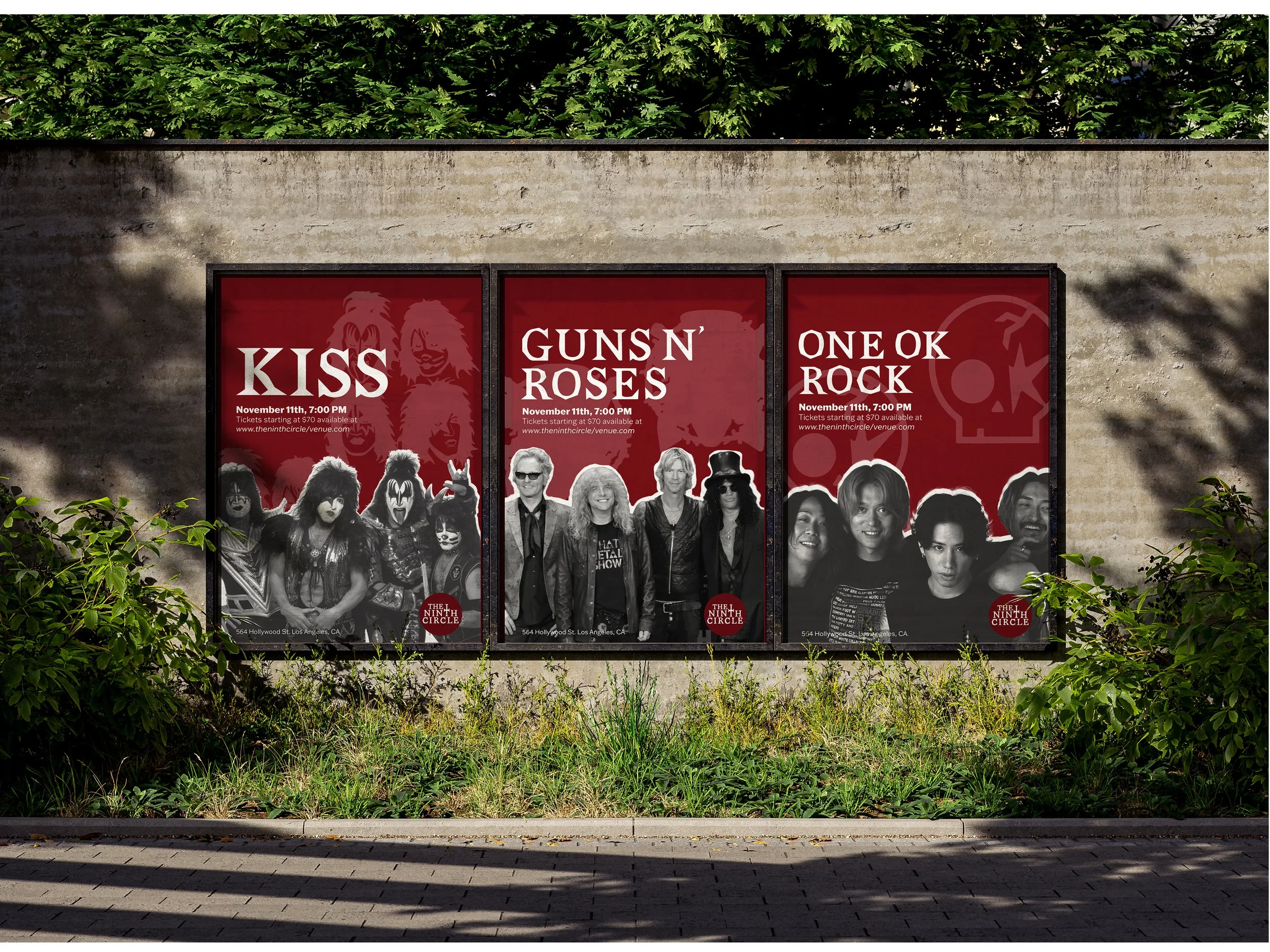
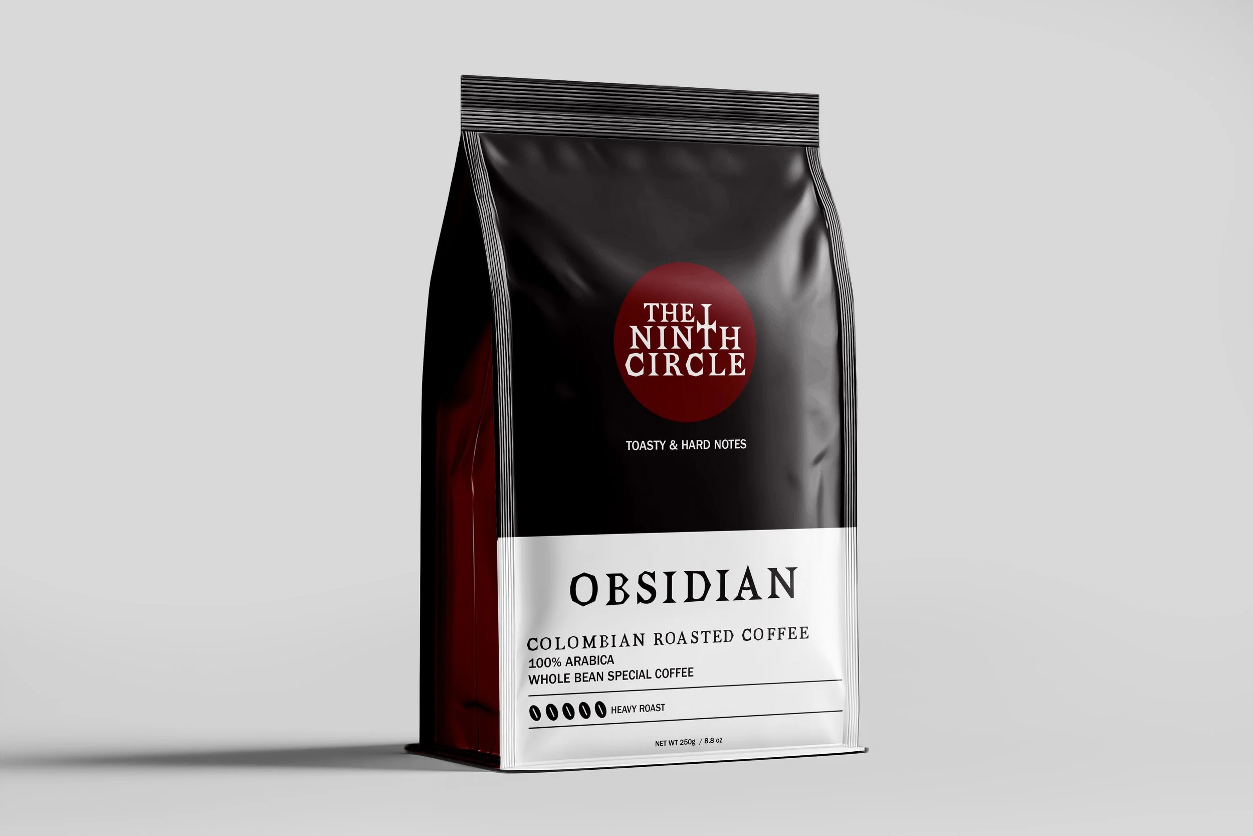
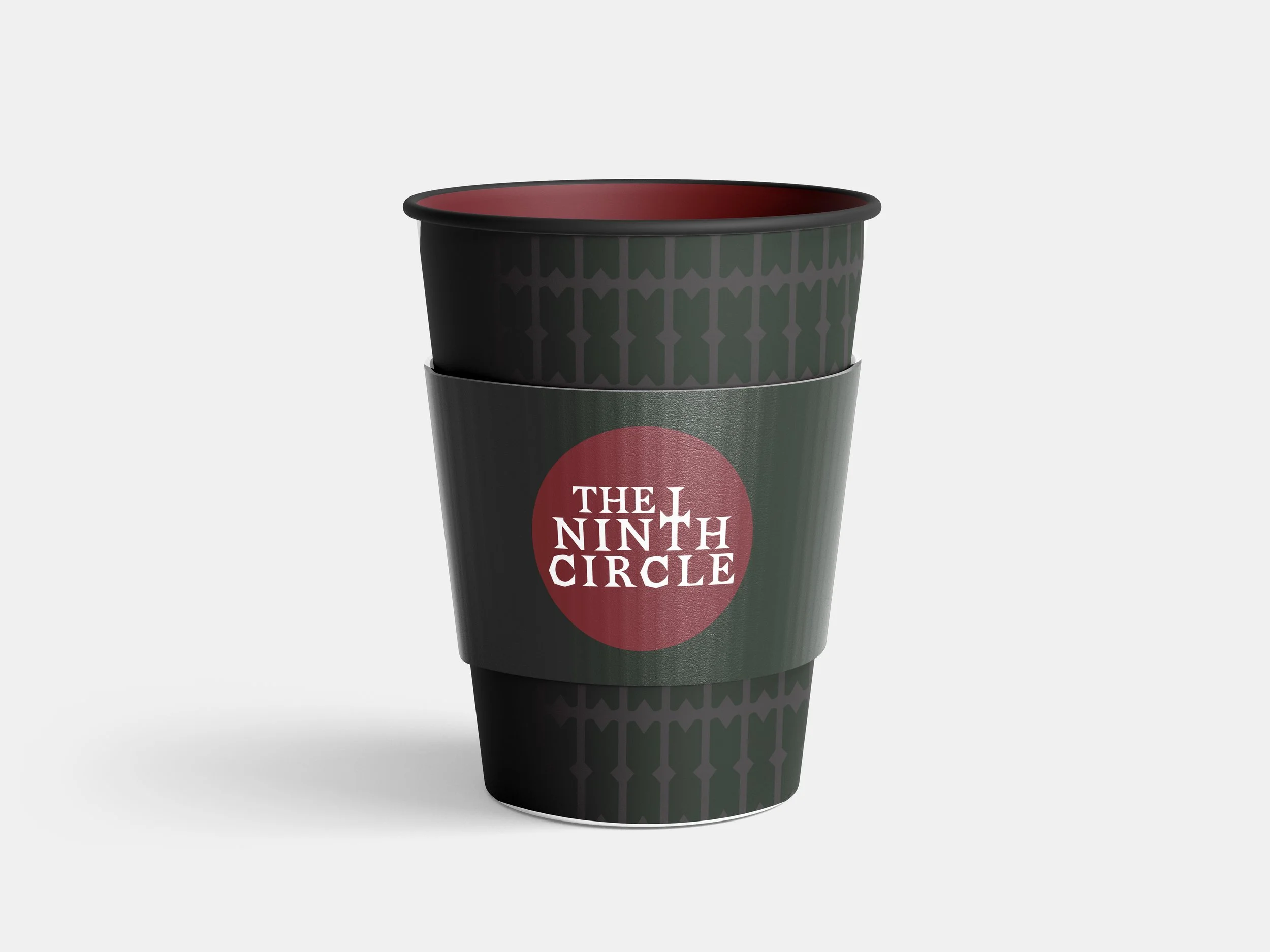
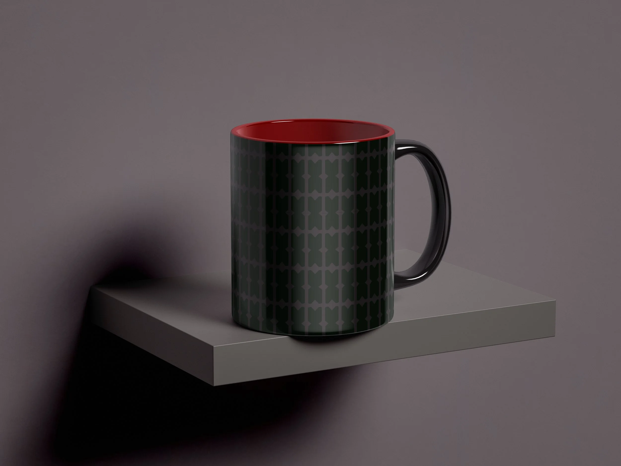
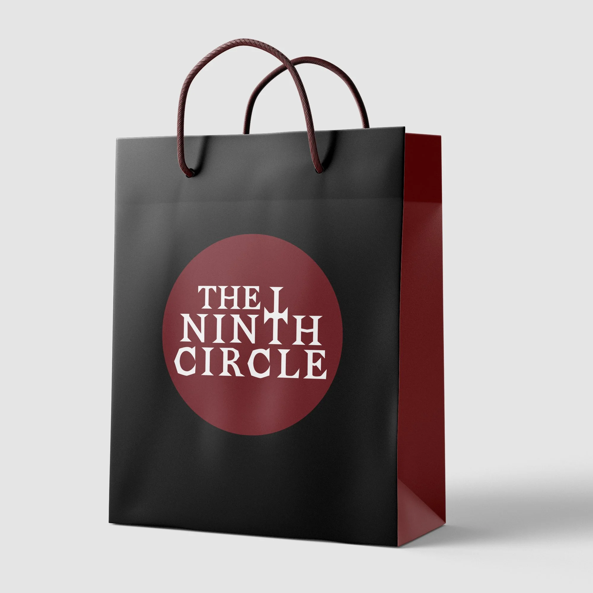
THE NINTH CIRCLE is more than a cafe; it’s a descent. Inspired by the deepest layer of Dante’s Inferno and the raw energy of hard rock culture, this venue serves as a sanctuary for the loud, the rebellious, and the refined. The branding bridges the gap between high concept literature and the grit of the metal scene.
The Intersection of Sin
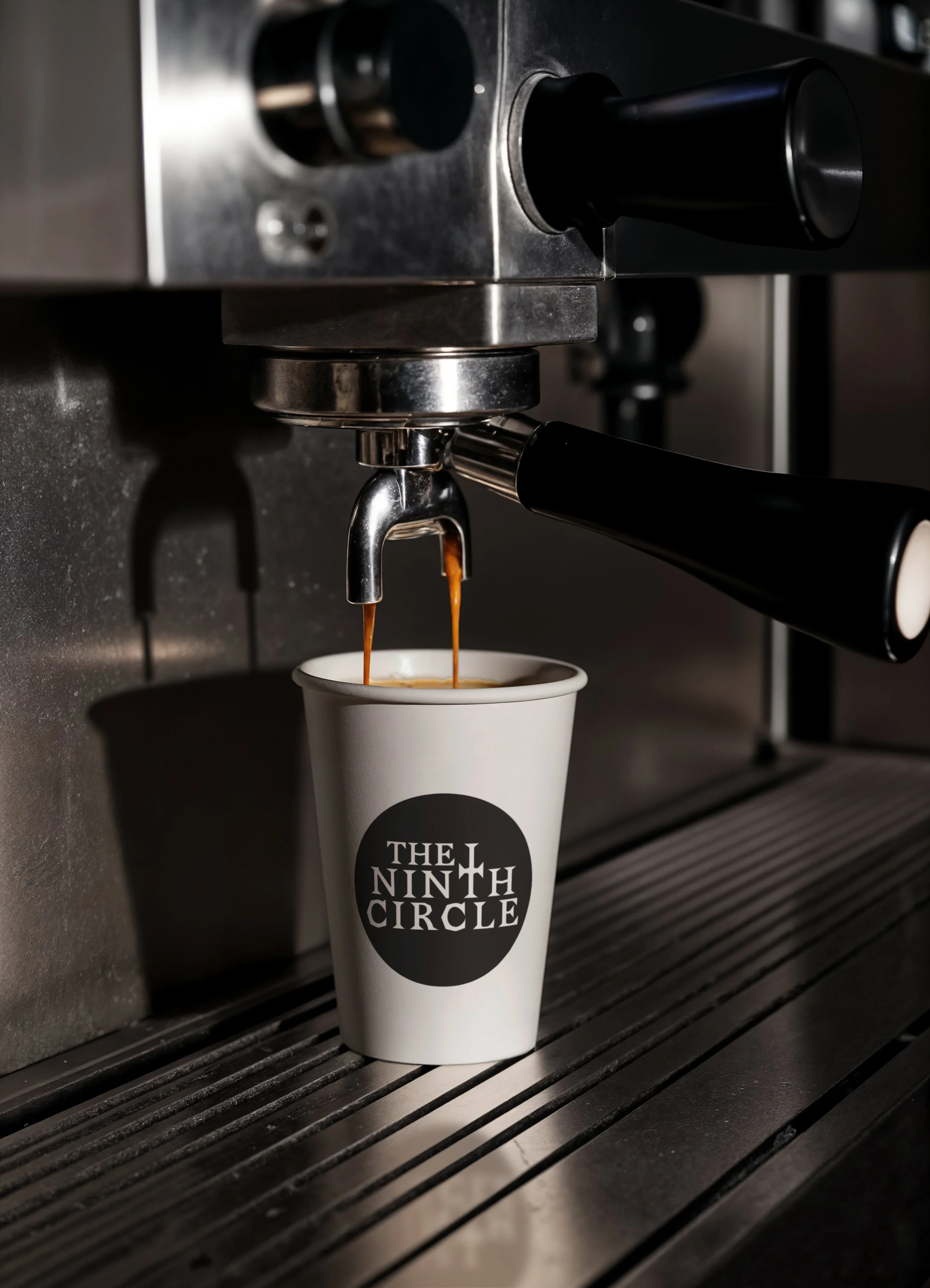
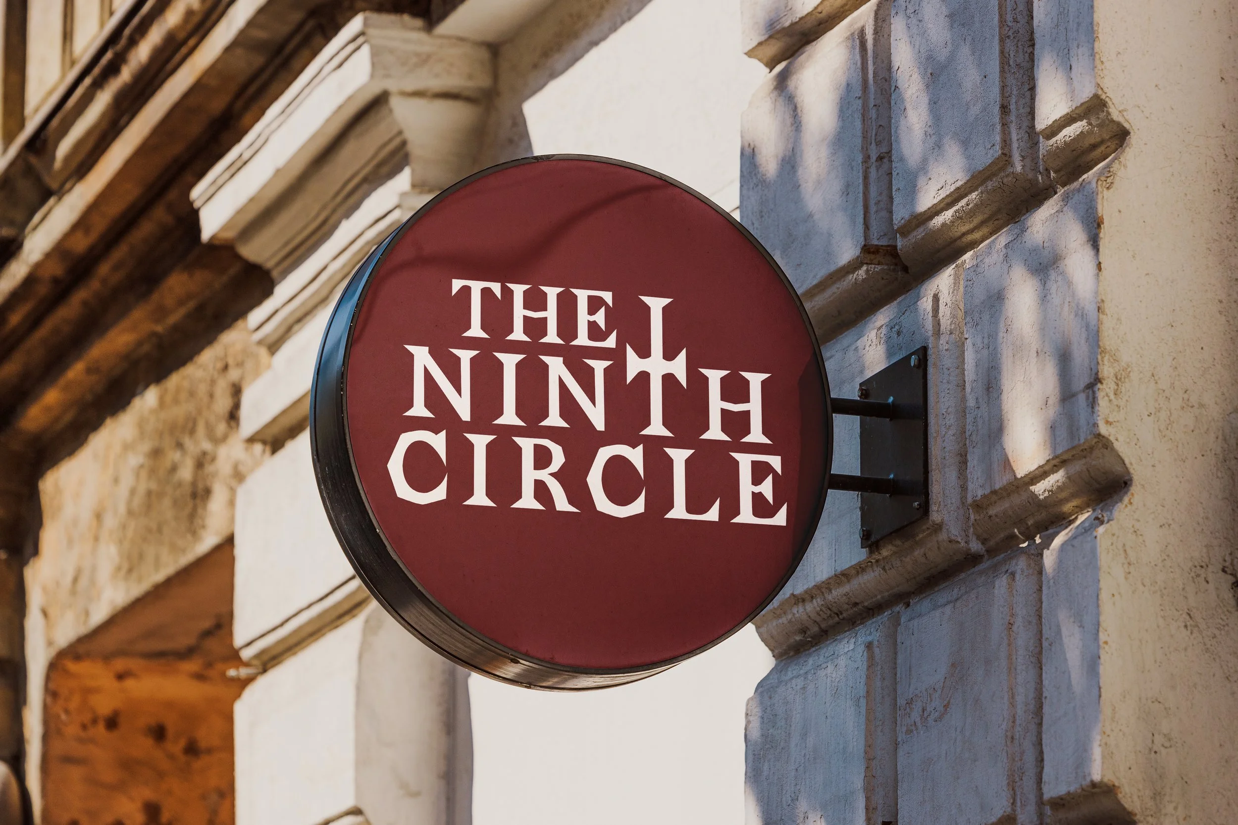
The centerpiece of the identity is a custom cross. While traditionally a symbol of the divine, here it is subverted to represent the Crossroads (the legendary place where rock history and folklore meet). It acts as a waypoint for those seeking a heavier experience.
Obsidian & Crimson
Deep Black: Represents the void and the underground nature of the metal scene. It provides a high contrast foundation that allows the venue's live visuals to pop.
Dark Red: Evokes the visceral energy of a live show, blood, heat, and the glow of stage lights. It moves the 'Ninth Circle' concept from Dante’s ice into the fiery heart of rock.
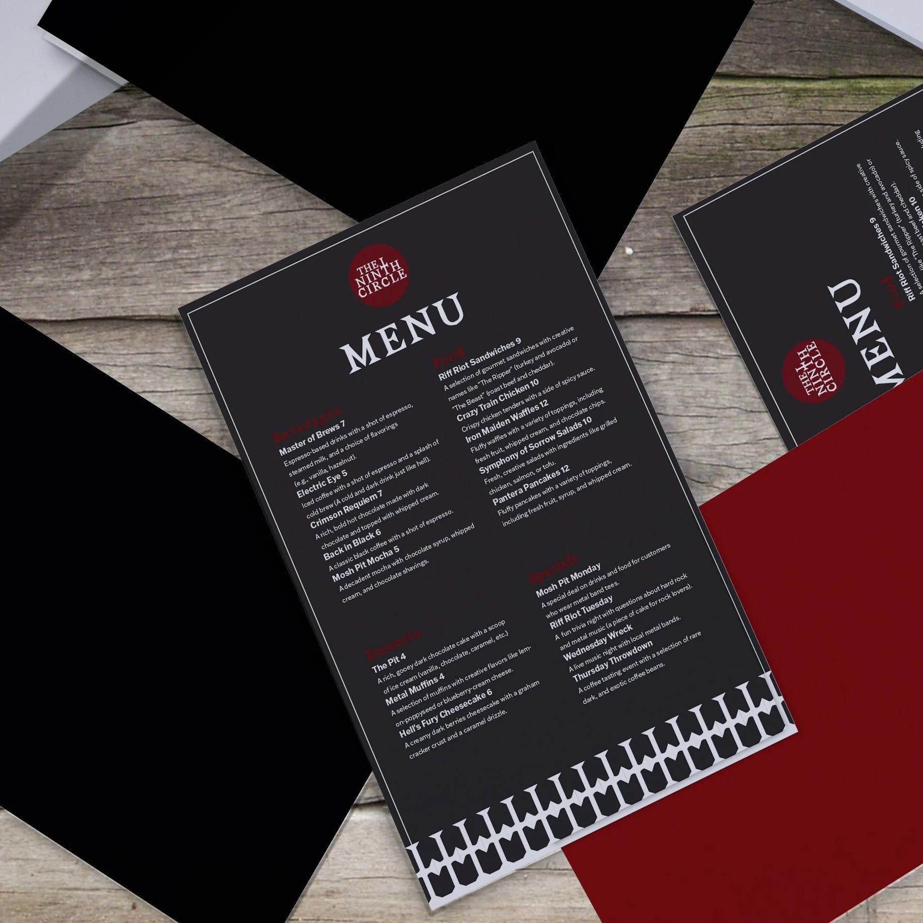
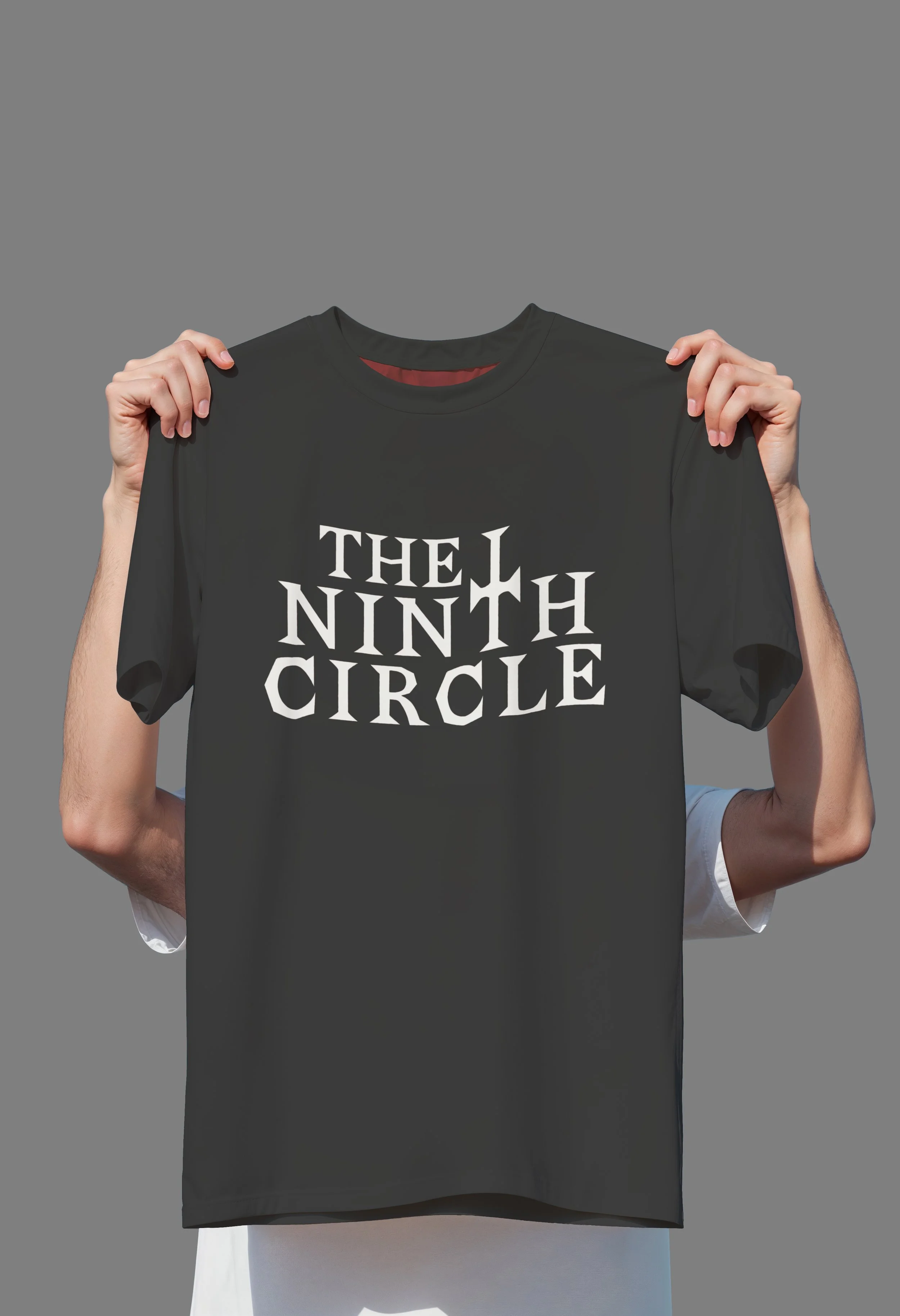
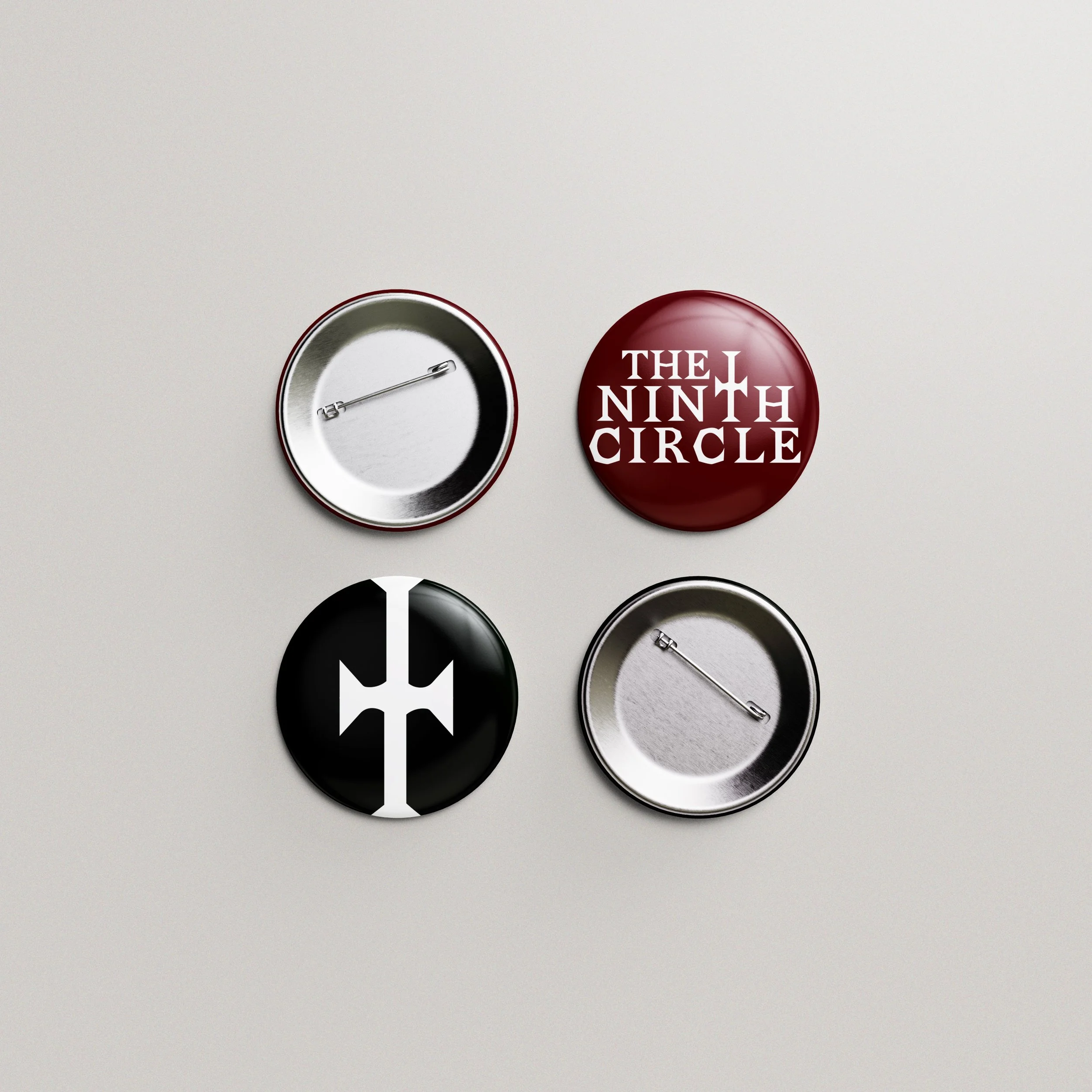
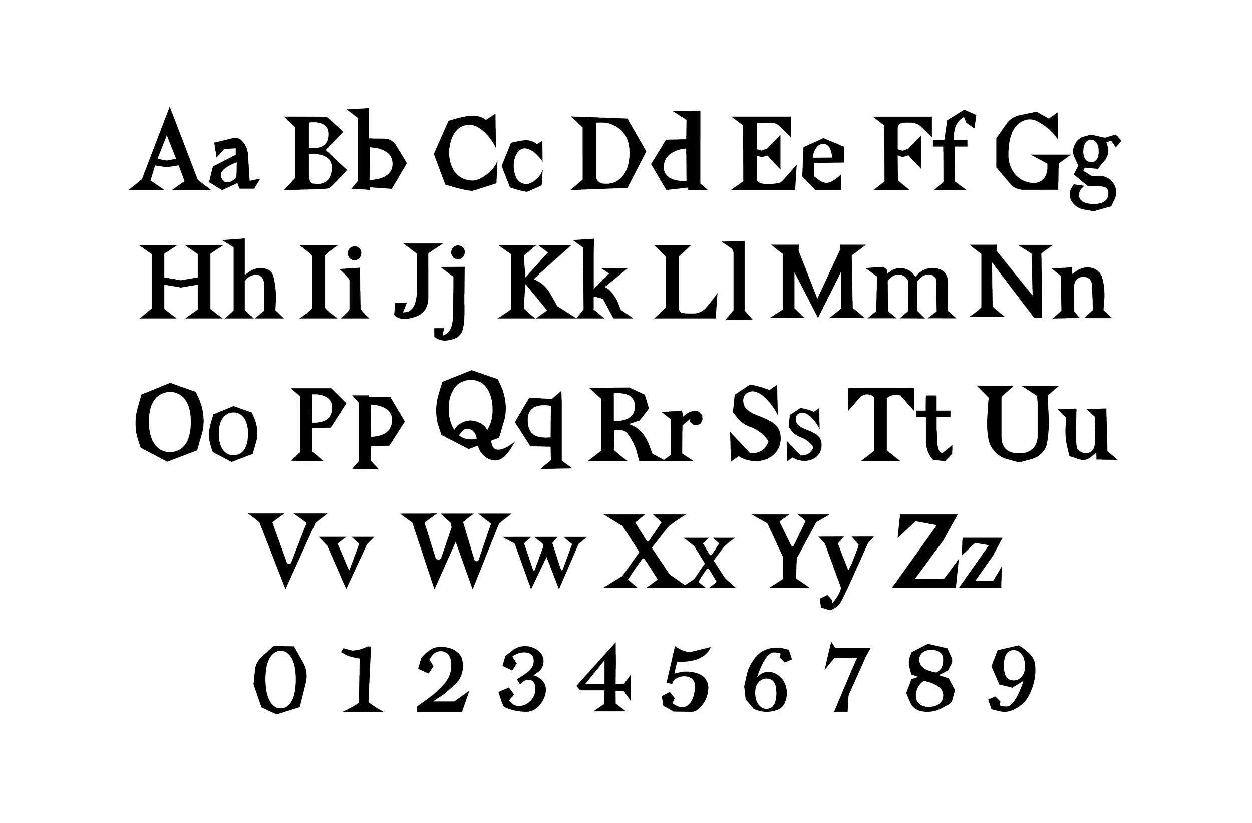
To ensure the brand felt truly proprietary, I developed Razors, a custom display typeface. Every letterform is built with aggressive, serrated terminals and sharp apertures, mimicking the edge of a blade or the bite of a distorted guitar riff. Razors was designed to remain legible under the low light conditions of a concert venue while maintaining a distinctive, menacing silhouette.