Kidzworld Redesign
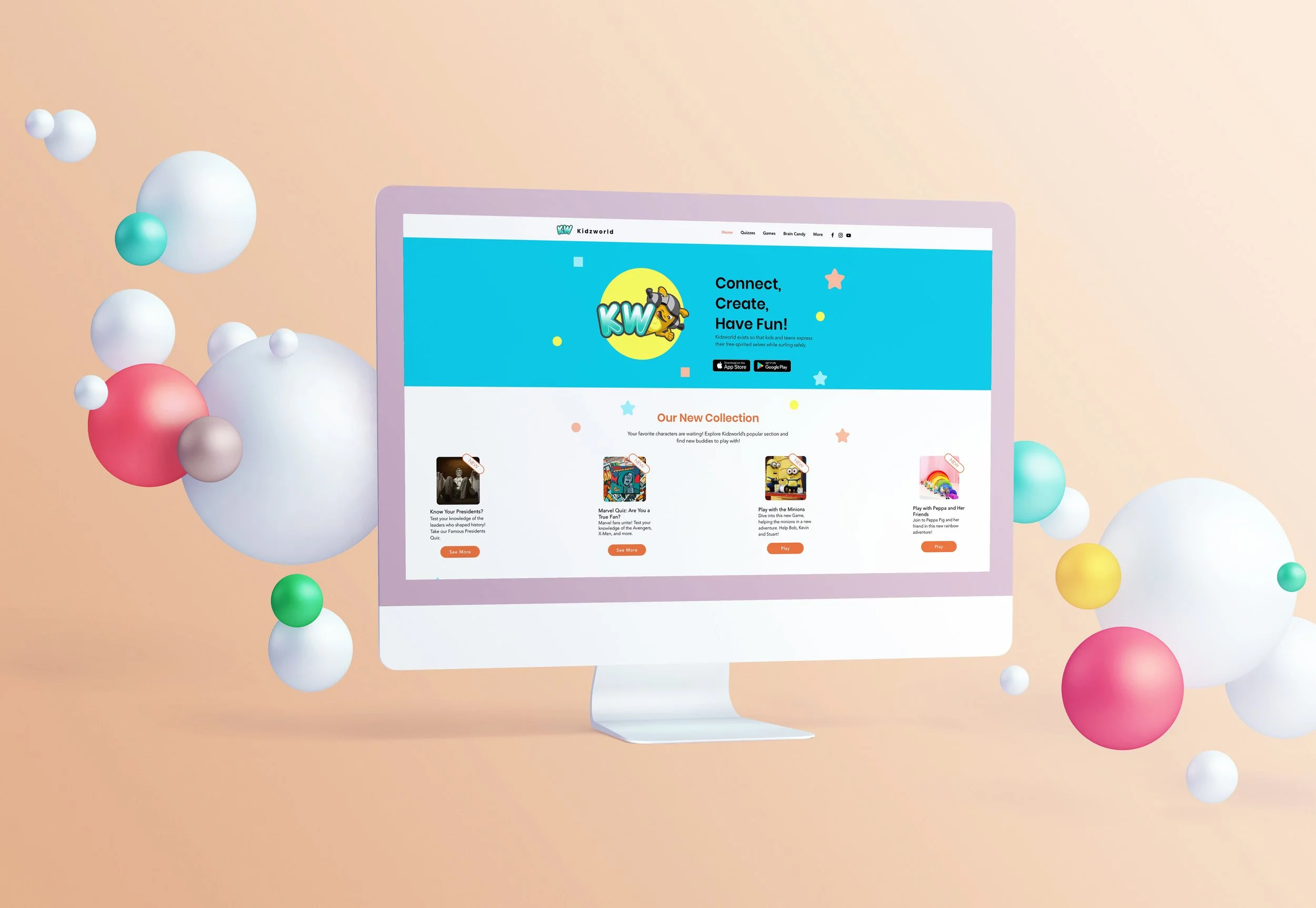
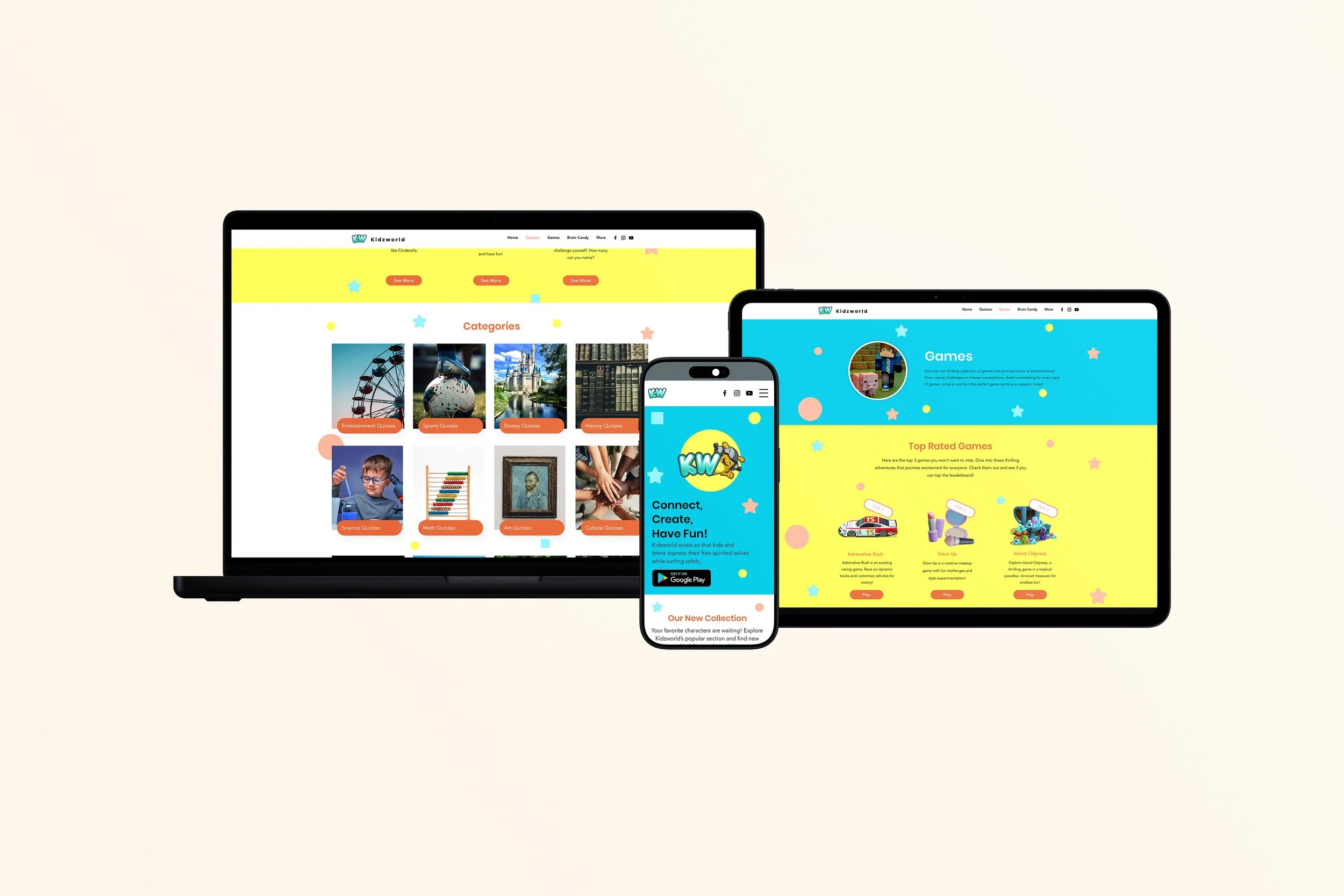
The goal of this project was to overhaul the user experience (UX) and user interface (UI) of Kidzworld.com. By transitioning to the redesigned "Kidzworld," the platform was transformed from a text heavy, disorganized site into a vibrant, intuitive environment. The new design prioritizes ease of navigation, visual engagement through movement and shapes, and a cohesive brand identity rooted in the original mascot’s color palette.
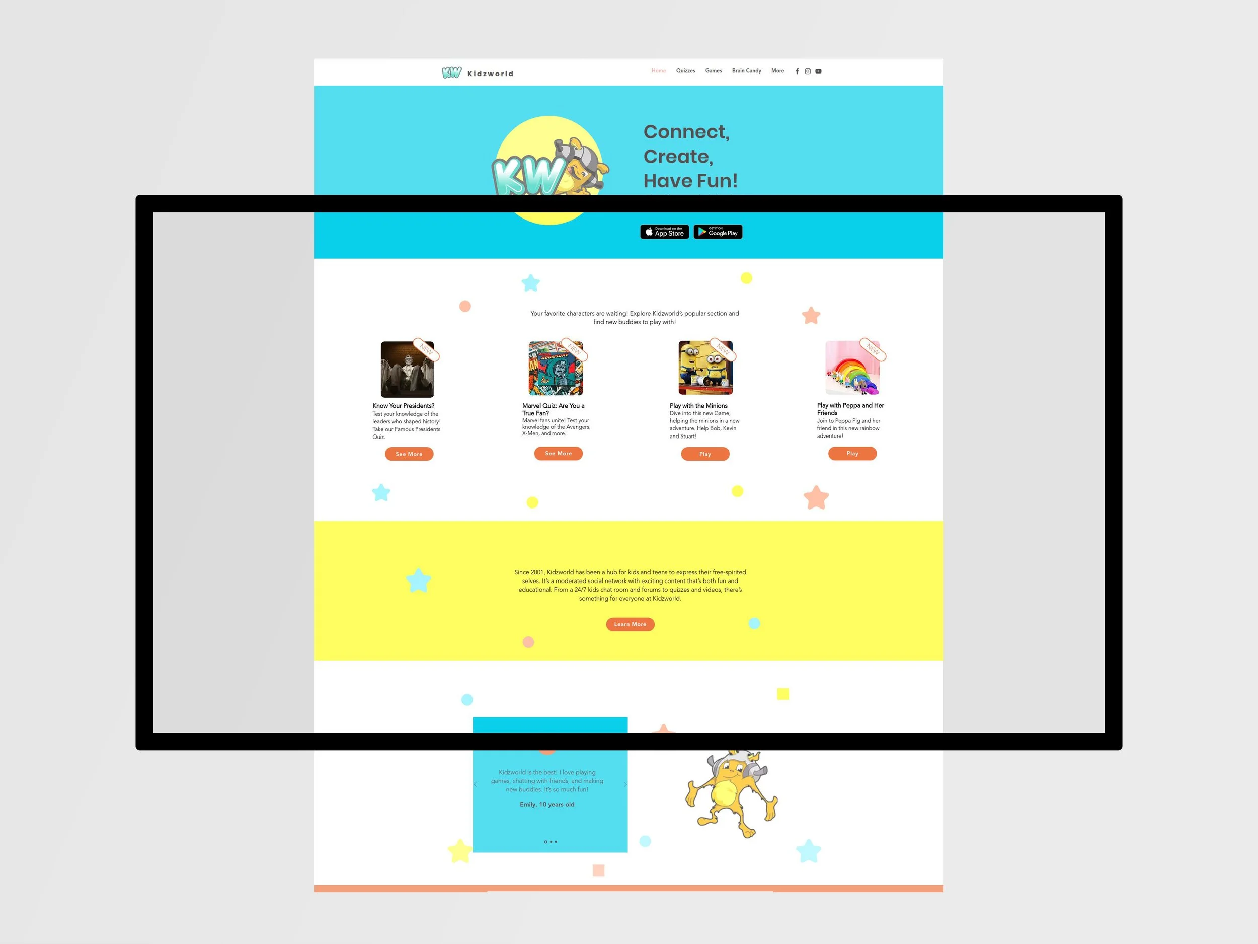
The KidzWorld redesign solves the problem of information overload by replacing a cluttered, "boring" layout with a streamlined navigation system that children can navigate instinctively. By stripping away unnecessary text and disorganized menus, the new interface prioritizes simplicity and ease of use, ensuring that games and homework help are always just a click away.
To bring the site to life, I integrated playful shapes and dynamic movement, transforming the static experience into an interactive playground. This sense of motion, paired with a vibrant color palette inspired by the original mascot, creates a fun and welcoming atmosphere that captures a child’s imagination while keeping the brand’s identity intact.
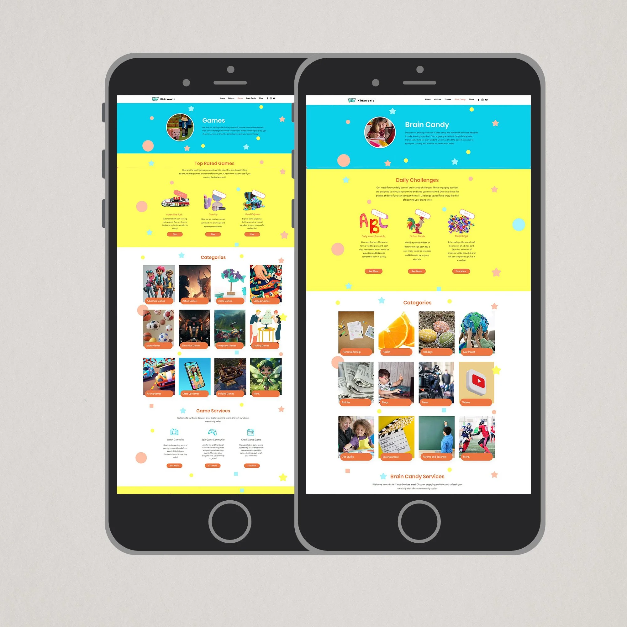
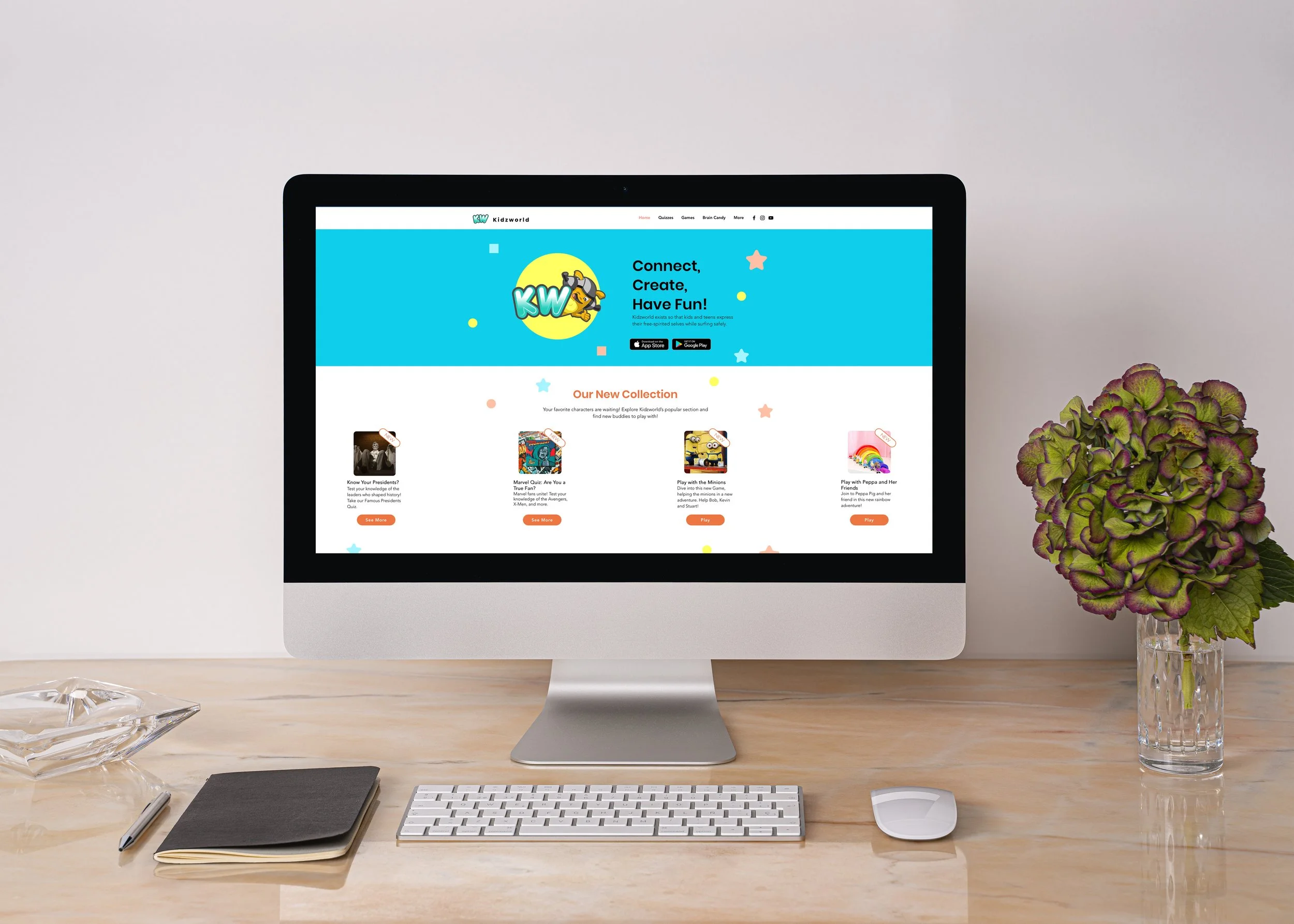
The "Kids Zone" redesign successfully bridges the gap between functionality and fun. By stripping away the clutter and introducing movement and modern design principles, the platform is now better equipped to engage kids and provide them with the games and homework help they need in a stress-free environment.
Past version: https://www.kidzworld.com
New Version: https://rebecajhovanaherre.wixsite.com/kids-zone