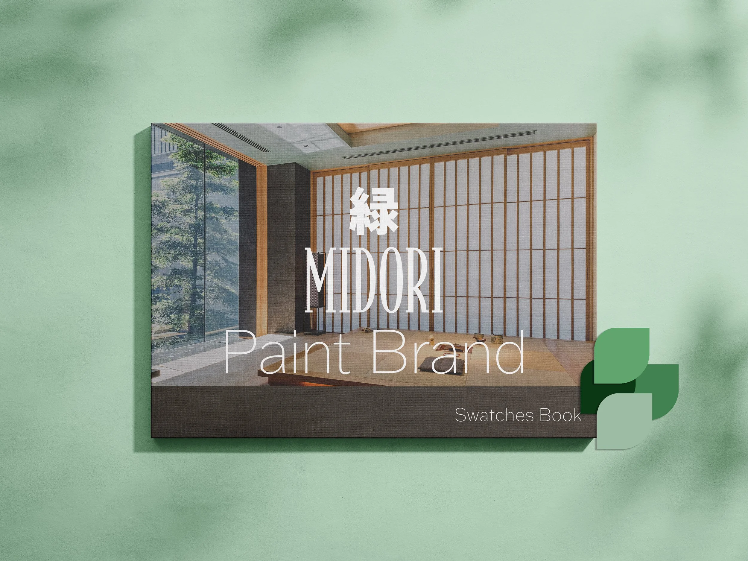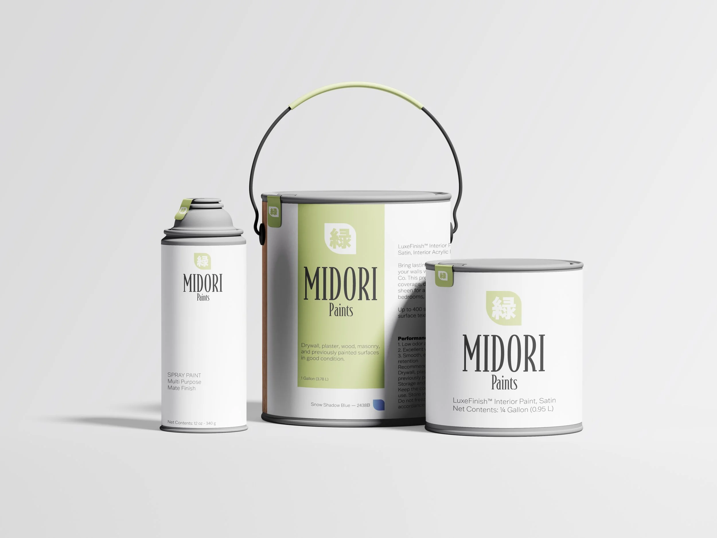
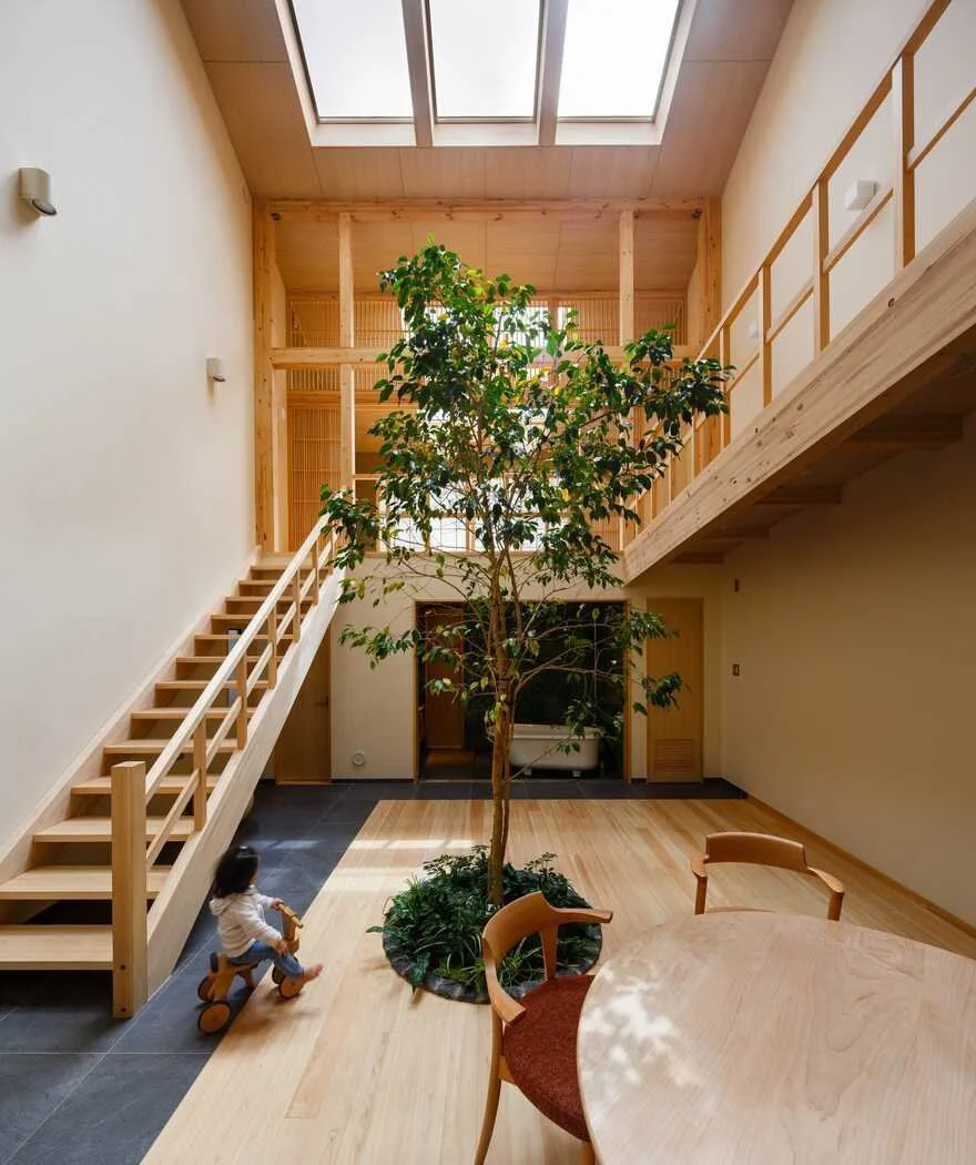
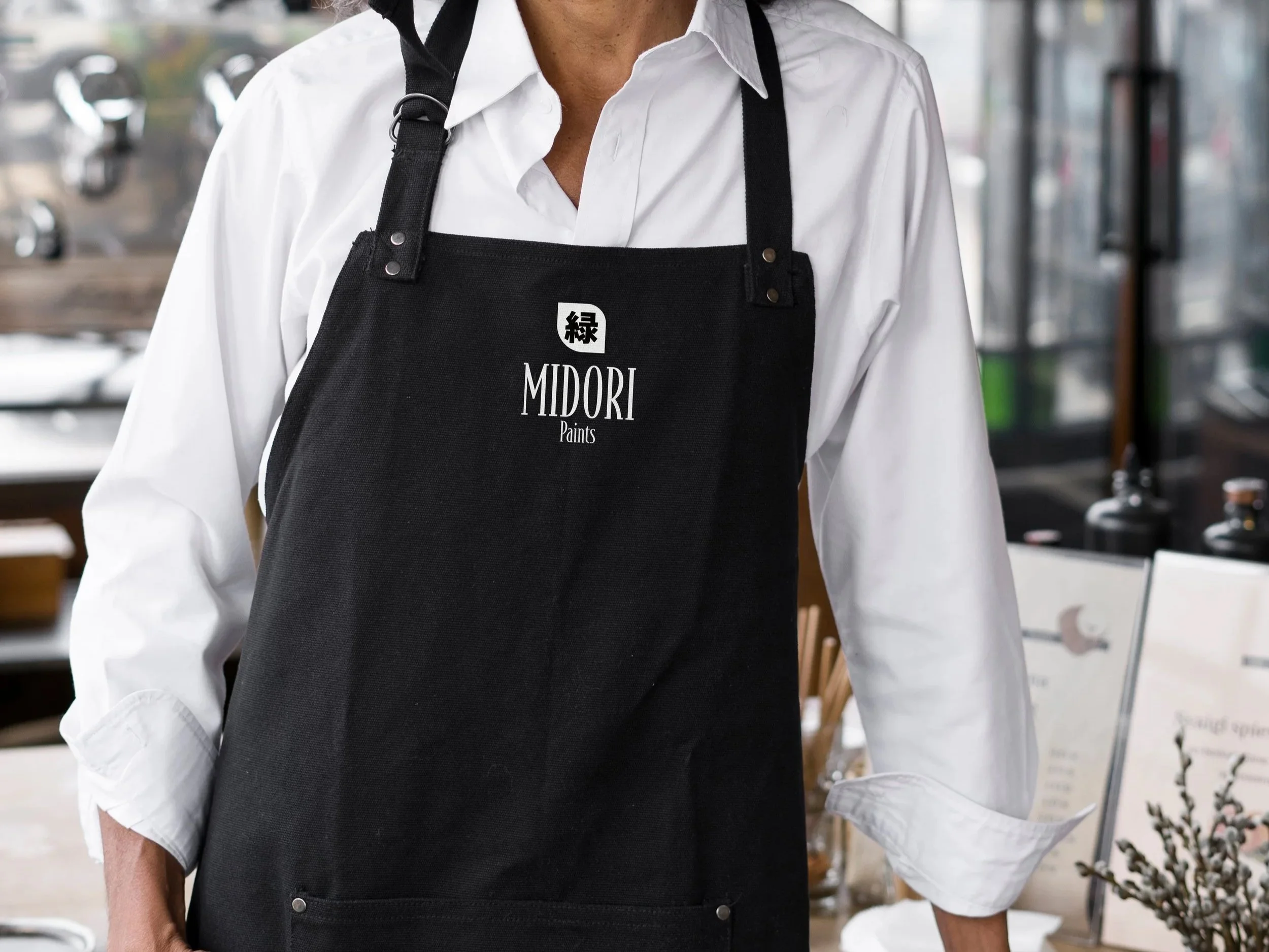
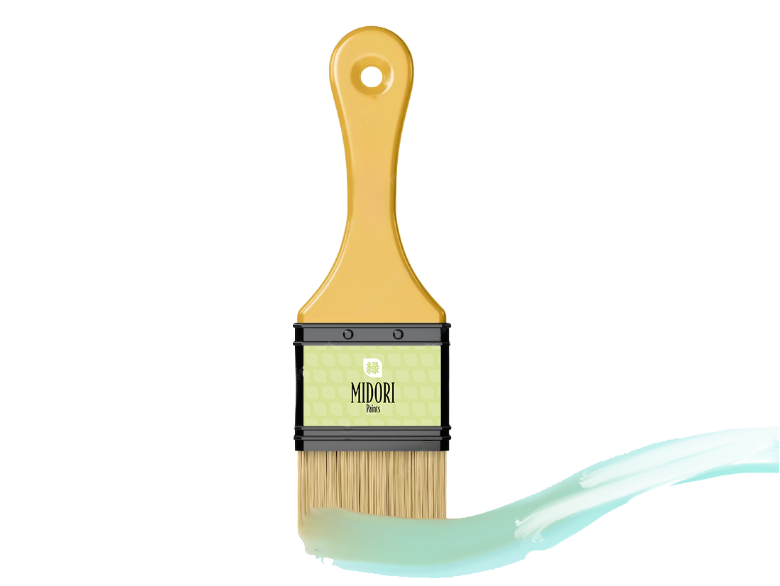
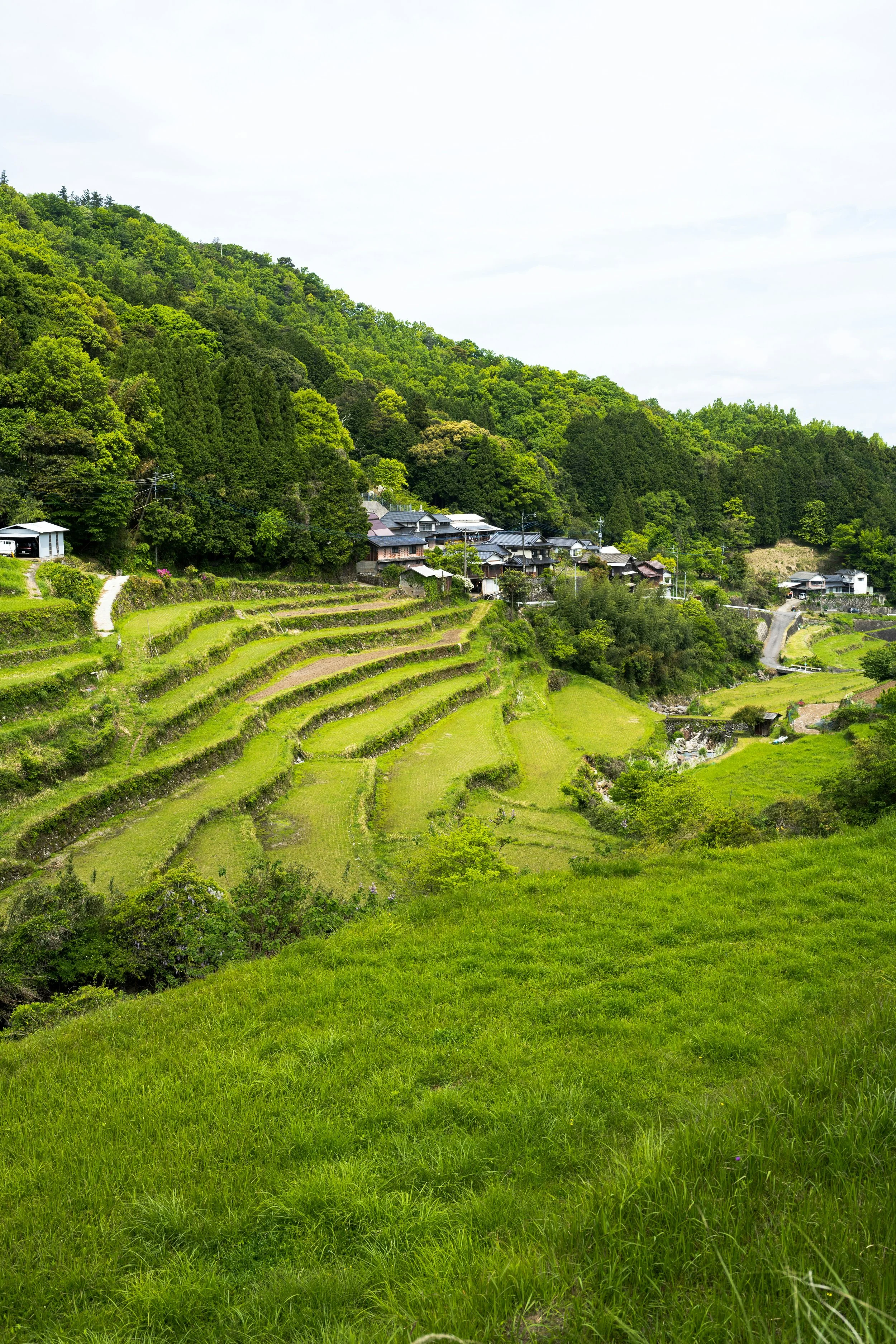
This paint brand embodies the essence of modern Japan, blending traditional culture with contemporary style. I drew inspiration from Japanese patterns, kimonos, and nature, which is reflected in the name “Midori” (meaning “green” in Japanese). I aimed to convey elegance and simplicity, as these values are deeply rooted in Japanese aesthetics.
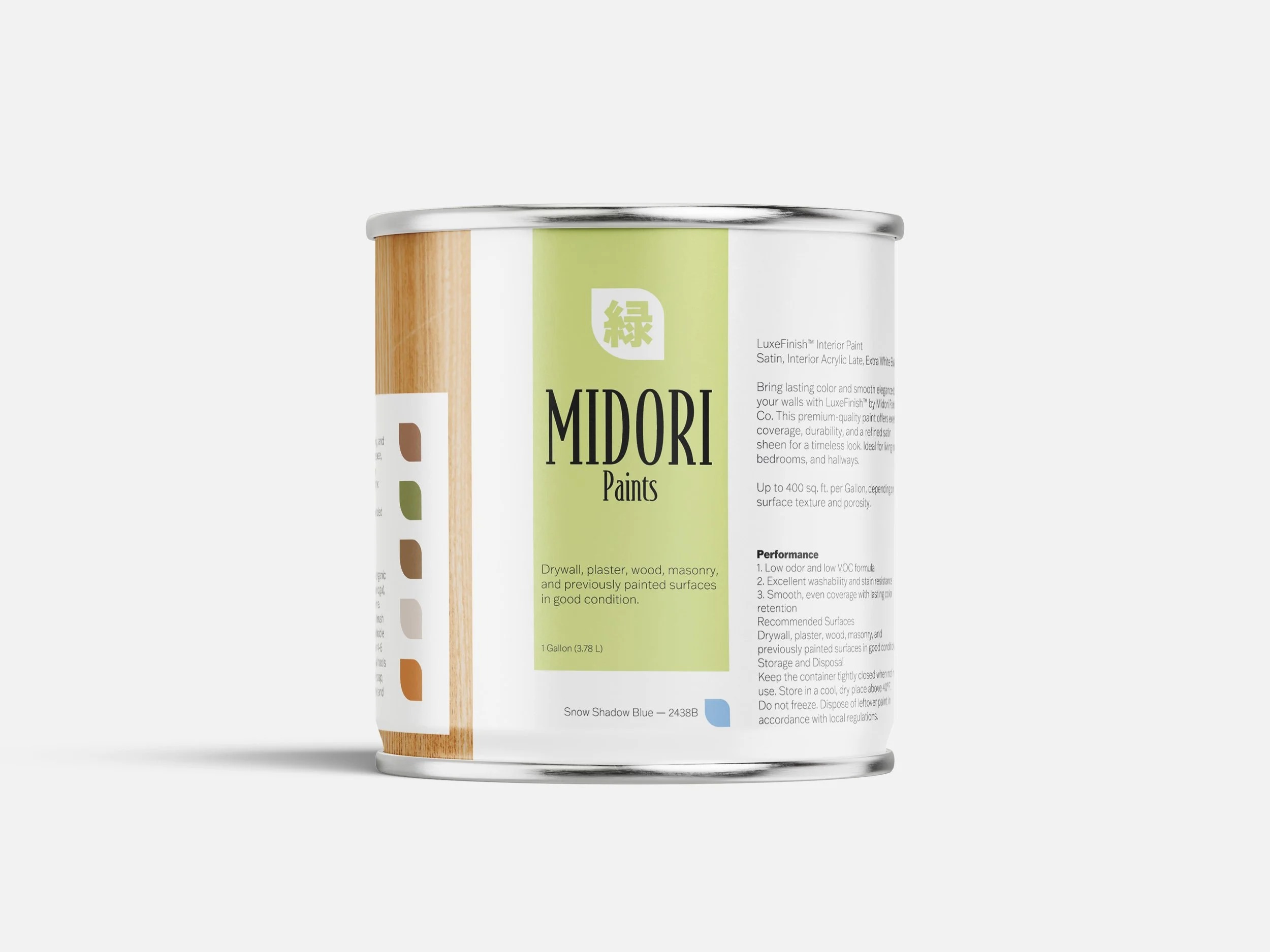
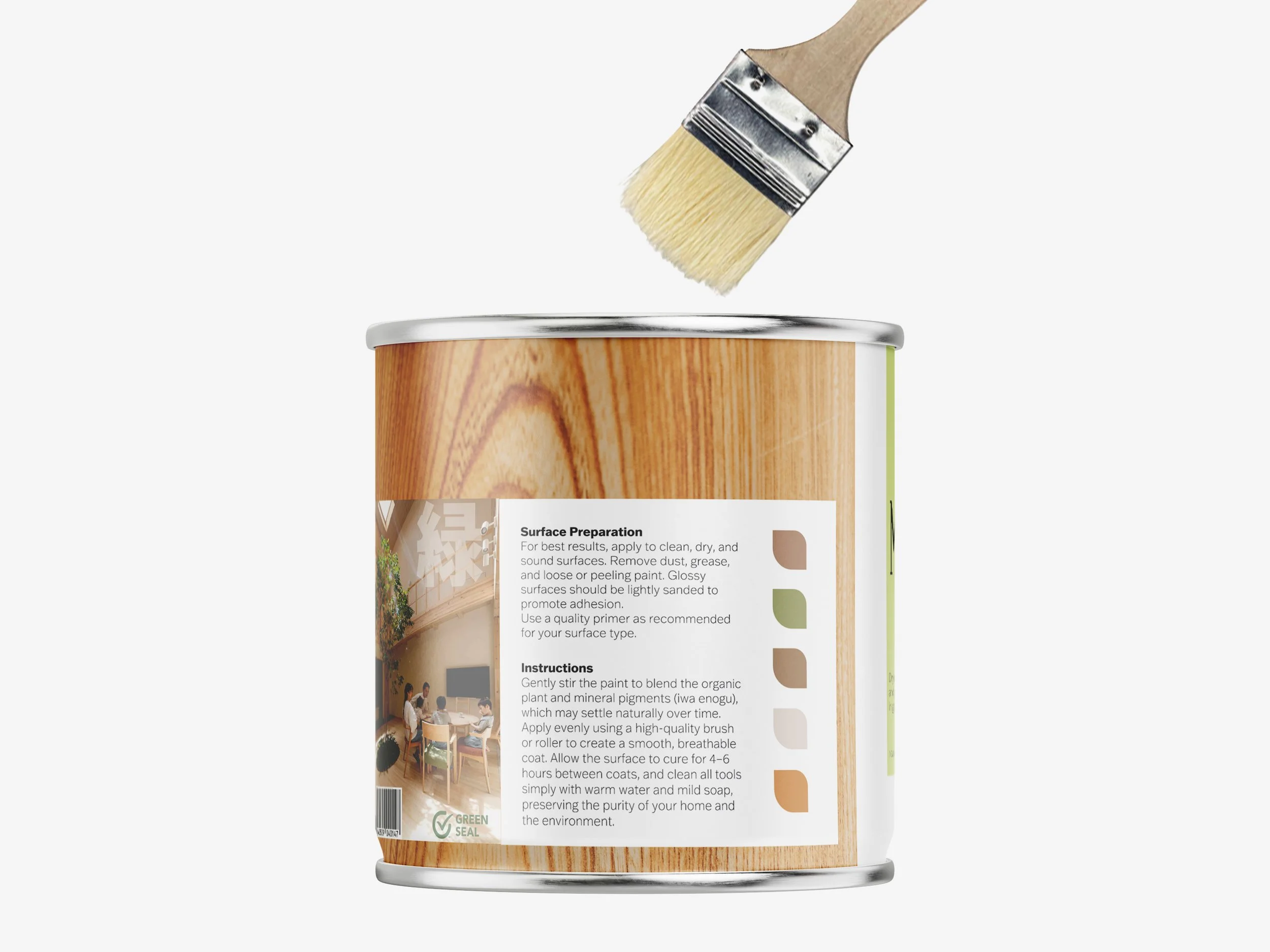
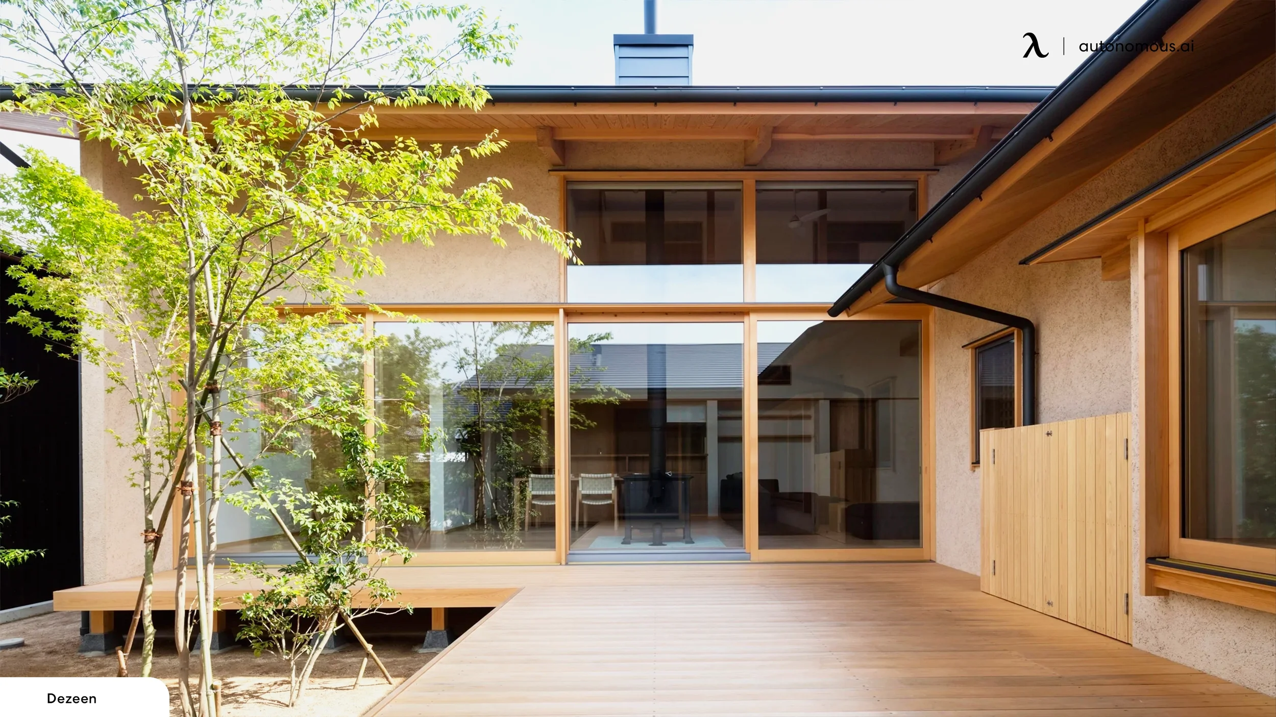
Drawing inspiration from Japanese architecture and modern minimalism, the design for Midori blends serenity and refinement with a strong commitment to sustainability. The packaging merges natural elements with functional aesthetics to appeal to eco-conscious consumers, directly reflecting the brand’s use of organic plant and mineral pigments (iwa enogu).
This deep connection to nature is central to the brand identity, symbolized by a leaf logo that honors the rich, natural origins of the paint.
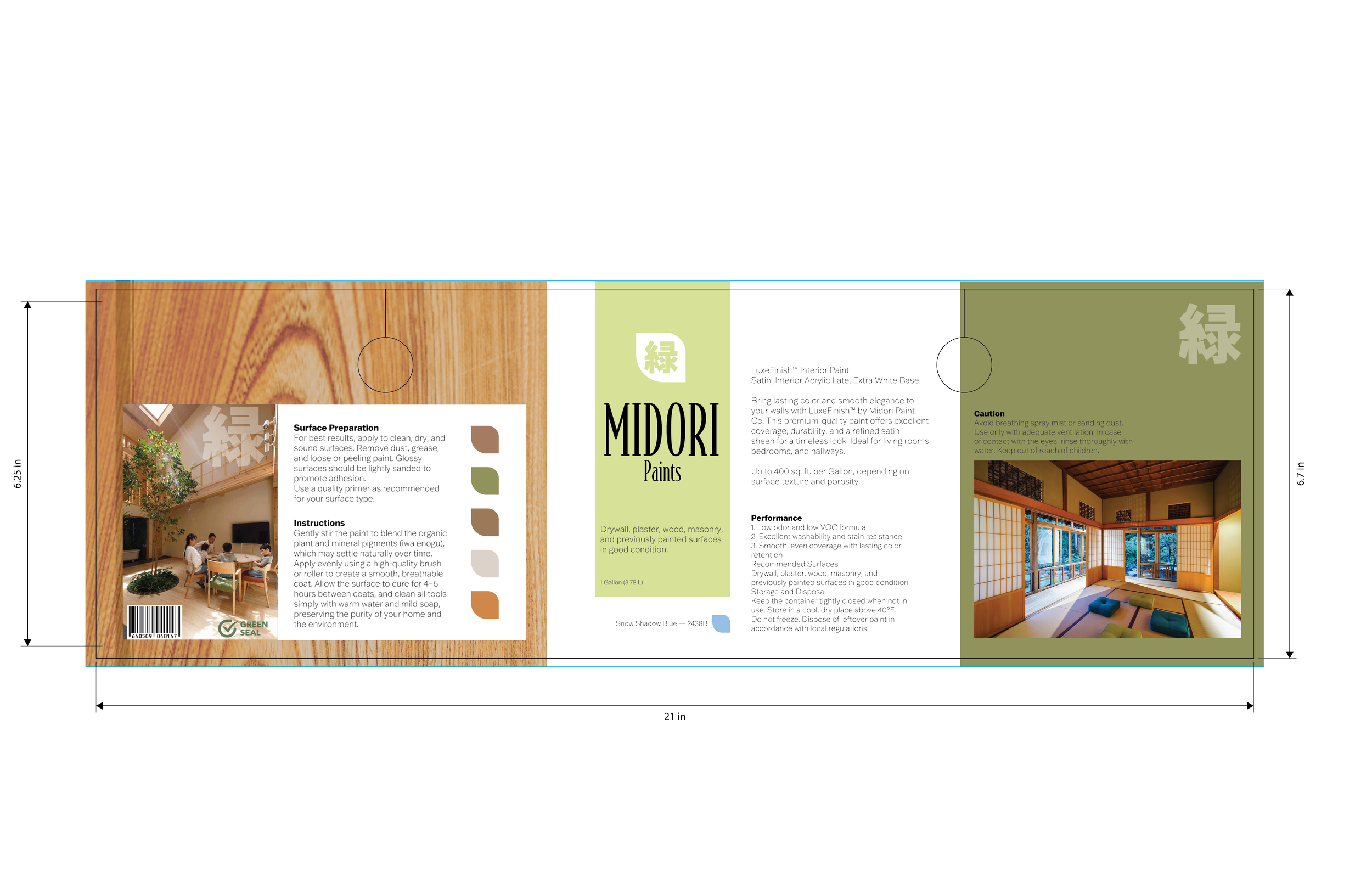
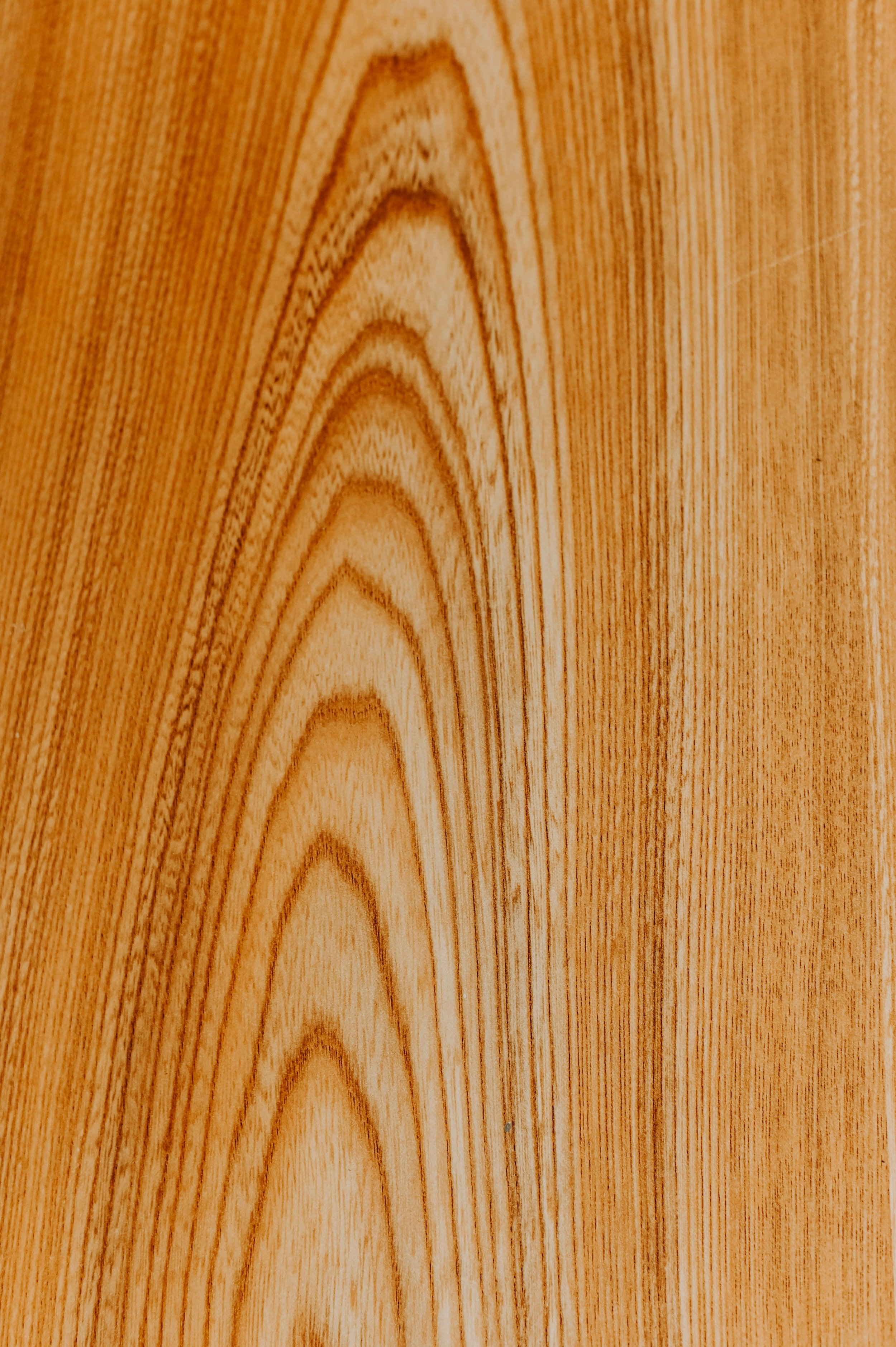
The palette avoids synthetic vibrance in favor of 'kacho-fugetsu' (the beauties of nature). I utilized muted tones derived from the 'Iwa Enogu' tradition, specifically focusing on moss greens, charred cedar blacks, and weathered stone greys.
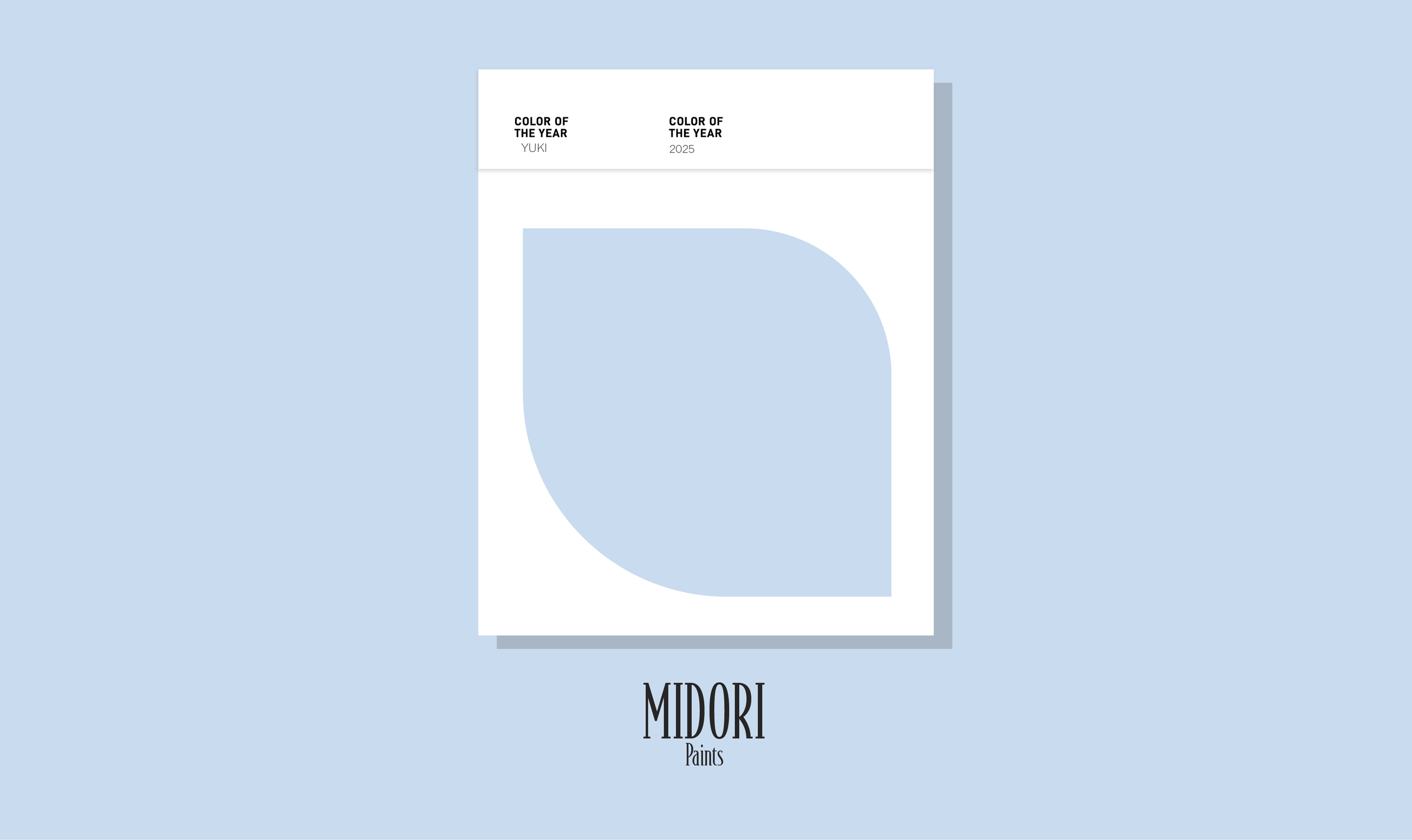
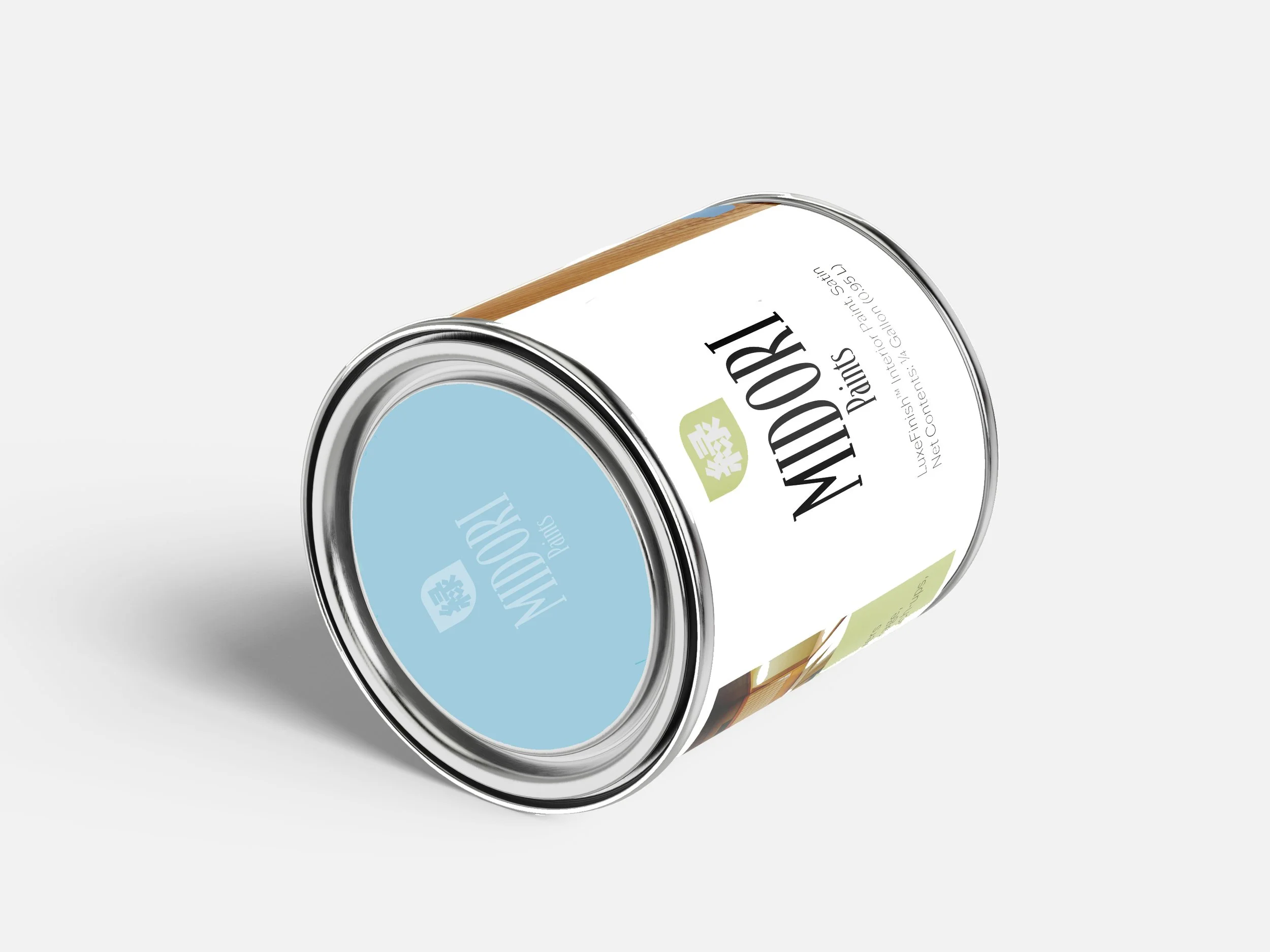
To balance tradition with modernity, I paired a refined, high contrast Serif (mimicking calligraphy strokes) with a clean, geometric Sans Serif. This reflects the contemporary style mentioned in the mission statement honoring the past while remaining functional for today.
地の彩り、未来の緑。
Chi no irodori, mirai no midori.
"The vibrancy of the earth, the green of the future."